
The Best Salon Websites in New Jersey And What They’re Doing Right
If you’re a salon owner or beauty artist right now, I want you to think about this for a second, because this is usually the piece no one wants to admit. Your work can be incredible, your clients can love you, your Instagram can even look good… but if your website isn’t matching that same level, there’s a disconnect happening, and that disconnect is usually where you’re quietly losing bookings without even realizing it.
And not just any bookings - the higher-end clients, the ones who aren’t questioning your pricing, the ones who are ready to move forward before they even hit your inquiry form. Those clients are making decisions based on how your brand feels as a whole, and your website is a huge part of that experience. It’s where they go to validate you.
So instead of just listing out what makes a “good” beauty website, I want to show you what that actually looks like in real life, because it’s a lot easier to see the difference than to try and piece it together on your own. These are real salon websites I’ve designed, all with completely different vibes, but built with the same intention behind them… to feel elevated, to feel clear, and to actually convert.
—
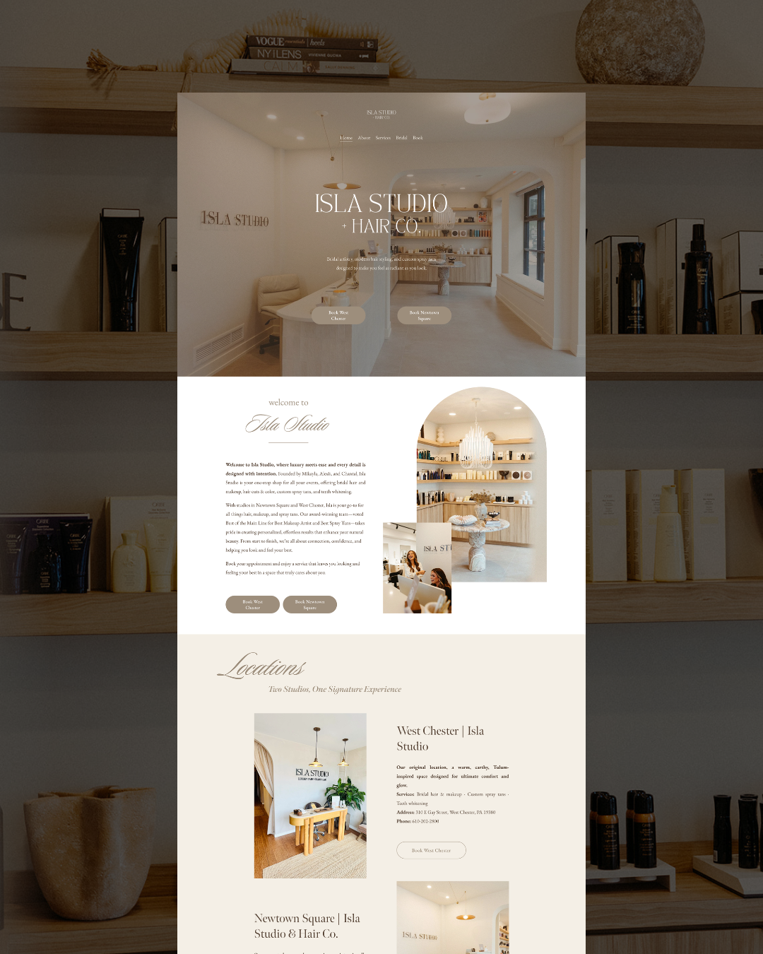
Isla Studio Beauty Bar
https://www.islastudiobeautybar.com/
This one has that soft, effortless luxury feel that a lot of people try to create, but very few actually pull off. Everything about it feels light and intentional without looking empty, which is a balance most DIY sites completely miss. The color palette is clean, the typography feels elevated but not overdone, and the layout gives you room to breathe as you’re scrolling, which immediately makes the brand feel more high-end.
What I love about this one is that nothing is competing for attention. You’re not being overwhelmed with ten different things to look at or trying to figure out where to go next. It’s calm, it’s clear, and it lets the work speak for itself, which is exactly what a luxury brand should be doing. It also makes booking feel really easy, which is something people don’t think about enough. If someone has to search for how to book or click around too much, they’re already halfway out the door.
—

Salon Milan
This one leans a little more structured, and you can feel that right away. It’s still elevated, but it’s more direct in how it presents information, which works really well for a service-based salon that wants clients to quickly understand what they offer and how to move forward.
The biggest thing this site does right is clarity. You land on it and you’re not guessing. You’re not trying to piece together services or figure out pricing or wonder what the next step is. Everything is laid out in a way that makes sense, and that builds trust faster than anything else. A lot of artists think their problem is visibility, when in reality it’s that their website is making people think too hard, and when people have to think too hard, they leave.
This one keeps things simple in the best way. It’s intentional, it’s clean, and every section has a purpose, which is what actually turns a website into something that brings in bookings instead of just sitting there looking nice.
—

Lash & Brow Boutique
https://www.lashandbrowbtq.com/
This one is more straight to the point, and that’s exactly why it works. This lash studio is a one page website that gives you all the info right there. It is also very branded - you can feel the vibe right away, and it doesn’t try to water itself down to appeal to everyone, which is where a lot of beauty businesses go wrong.
When your website starts trying to attract “anyone who needs lashes,” you end up blending in with everyone else, and suddenly you’re competing on price instead of experience. This site doesn’t do that. It’s clear, it’s specific, and it speaks to a certain type of client, which naturally filters in the right people and filters out the ones who were never a good fit to begin with.
A strong website isn’t just about bringing more people in, it’s about bringing the right people in, the ones who already align with your brand and aren’t questioning whether you’re worth it.
—

Grace Hair Studio
https://www.grace-hair-studio.com/
This one feels really polished and cohesive, which sounds simple, but it’s actually what most websites are missing. Everything ties together… the imagery, the colors, the spacing, the overall tone… and because of that, it feels like a real brand, not just a collection of pages.
That consistency does more than just make it look good. It builds trust, and it also helps with how your site performs in search, which is something a lot of artists don’t even think about. A well-structured, intentional site is easier for Google to understand, easier for clients to navigate, and overall just works better on every level.
And yes, all of these sites are built on Squarespace, which is a big part of why they function the way they do. It gives you the flexibility to create something that feels custom while still being easy to manage, which is exactly what most beauty businesses need.
—
What All of These Salon Websites Have in Common
Even though these all look different, they’re built on the same foundation, and that’s the part that actually matters. They all feel high-end from the second you land on them, not because they’re doing the most, but because they’re doing the right things well. They’re easy to navigate, so you’re never wondering where to click or what to do next. They use strong, intentional visuals that support the brand instead of distracting from it, and everything on the site naturally guides you toward booking without feeling pushy or overwhelming.
That’s what a high-converting beauty website actually looks like. It doesn’t just sit there looking pretty, it moves people through an experience that ends with them taking action.
—
Why Your Website Matters More Than You Think
Your website isn’t just a place to send someone after they find you on Instagram, it’s what decides whether they actually move forward with you or not.
Before someone inquires, they’re already asking themselves if they trust you, if you feel experienced, if your pricing makes sense, and if the overall experience feels worth it. Your website is answering all of those questions for you, whether you realize it or not.
So if your inquiries feel inconsistent, if people are ghosting after seeing your pricing, or if you’re attracting more budget clients than you want to be working with, it’s usually not random. It’s usually your online presence not fully supporting the level you’re trying to operate at.
—
If You’re Sitting There Thinking “Mine Doesn’t Look Like This”
Good - that means you see it.
And once you see it, you can’t really unsee it, which is where things start to change, because when your website actually matches your work, your pricing, and the type of clients you want to attract, everything starts to feel easier. You’re not chasing people, you’re not over-explaining your value, and you’re not relying on social media to constantly bring in leads.
You have something working for you in the background, bringing in people who already decided you’re the one.
—
Final Thought
You don’t need more followers. You don’t need to be posting every single day or trying to keep up with every trend.
You need a website that makes people trust you, understand you, and want to book you without needing to be convinced.
That’s the difference between a busy artist and a fully booked brand, and once you have that piece in place, everything else starts to fall into place a lot faster.
If you’re ready to create a website that does all the heavy lifting for you, then apply today for your custom website and brand design. After designing for over 100 beauty industry businesses, I have learned what works and what doesn’t work when it comes to this industry. Let’s come up with a strategy and make a website that does the work for you. Don’t miss out on something that will double your income this year.

Until next time,
Natalie Kauth